The climate logo Rorschach test
PARIS, January 16, 2015 - Each year, the country that hosts the UN's conference on climate change dishes out a wad of cash on a logo. The usual request to graphic designers is to provide something cosy. Something planetary. You know, we-are-the-worldish.
Whether all the hugginess works is another matter.

-
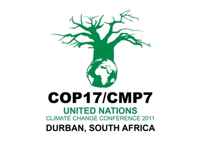
When I travelled to Durban, South Africa, in 2011, for the 17th Conference of the Parties (COP, in climate speak), the chosen logo was a giant, leafless tree. South Africa had intended to convey a baobab, a resilient tree under whose branches villagers gather to talk. But baobab-ignorant delegates saw the image as a portent of doom -- a tree that was dead or dying, presumably as a result of climate change.

-
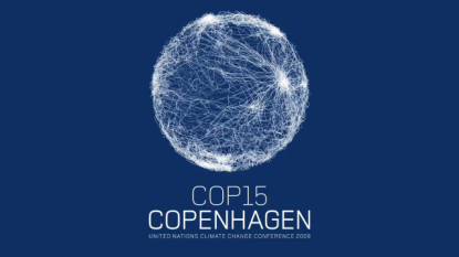
In similar vein, the logo of the COP15 in Copenhagen in 2009 developed a notoriety of its own as the meeting wound on. Showcased as the summit which would break the carbon juggernaut, the event was a near-fiasco: a battleground for airing ancient grievances, defending entrenched national interests and tangling all the issues.
By the time the conference had ground to its fractious close, the logo seemed to us all less like the symbol of an interconnected world and more like a plate of spaghetti -- or a bad-news retinal scan.

-
Last year's circular logo, for COP20 in Lima, was intended to provide a colourful Peruvian frill to the typical planetary motif. But on a black background, it looked bleak and relentless -- "an Eye of Sauron," one observer quipped to me as the gruelling talks went into a second unscheduled day.
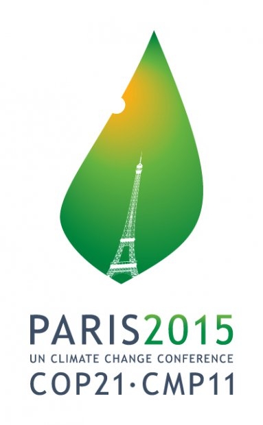
So what are we to make of the logo unveiled this week by France, where 195 countries are supposed to seal a historic pact in December? Is it a leaf nibbled by an ant? The Eiffel Tower, melting under a scorching Sun? Or a drop of biofuel, representing a greener, cleaner future?
Richard Ingham is AFP's science, health and environment coordinator based in Paris

-


